3 minutes
Robust Plotting with Outliers
Recently I had a situation where I was plotting some data where there was some highly likely measurement error. This is often talked about academically but it is not clear what problems this can cause and what we can do (or should do) about them. At various times throughout the month the value that we cared about would drop to almost (but not quite) 0. In this case this was highly unlikely (though not impossible) outcome so it is a candidate for potential measurement error. I did a quick look for standard things (weekends, holidays etc.) to give justification for just filtering them out but there was no discernable pattern.
To illustrate here is a mocked up dataset that has similar properties:
set.seed(2023)

# 105 Weekly True Observations
true_vals <- rnorm(n = 105, mean = 100, sd = 5)
# Create the Observed values
obs_vals <- true_vals
# Select 10 obs to replace
meas_err_obs <- sample(size = 10, c(1:100), replace = FALSE)
# Replace them with a much lower mean
obs_vals[meas_err_obs] <- rnorm(n = 10, mean = 20, sd = 2)

# Create a Tibble to plot with
obs <- tibble(
  date = seq(as.Date("2021/1/1"), as.Date("2023/1/1"), "weeks"),
  obs_vals = obs_vals
)
If we plot this using ggplot we get the following output, which follows what we would expect from the above, a large amount of observations at around the 100 mark, with a low cluster of them at around 10.
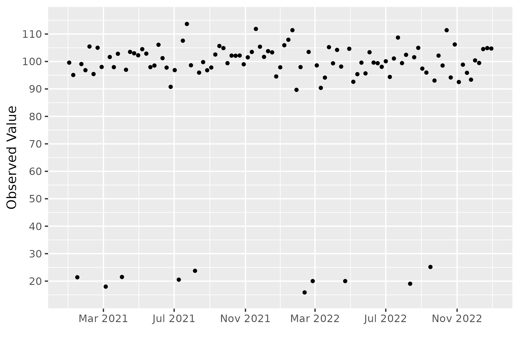
Plot of the observed points
When we add geom_smooth() to it the issues with the standard smoothing method becomes clear:
p2 <- p + geom_smooth()
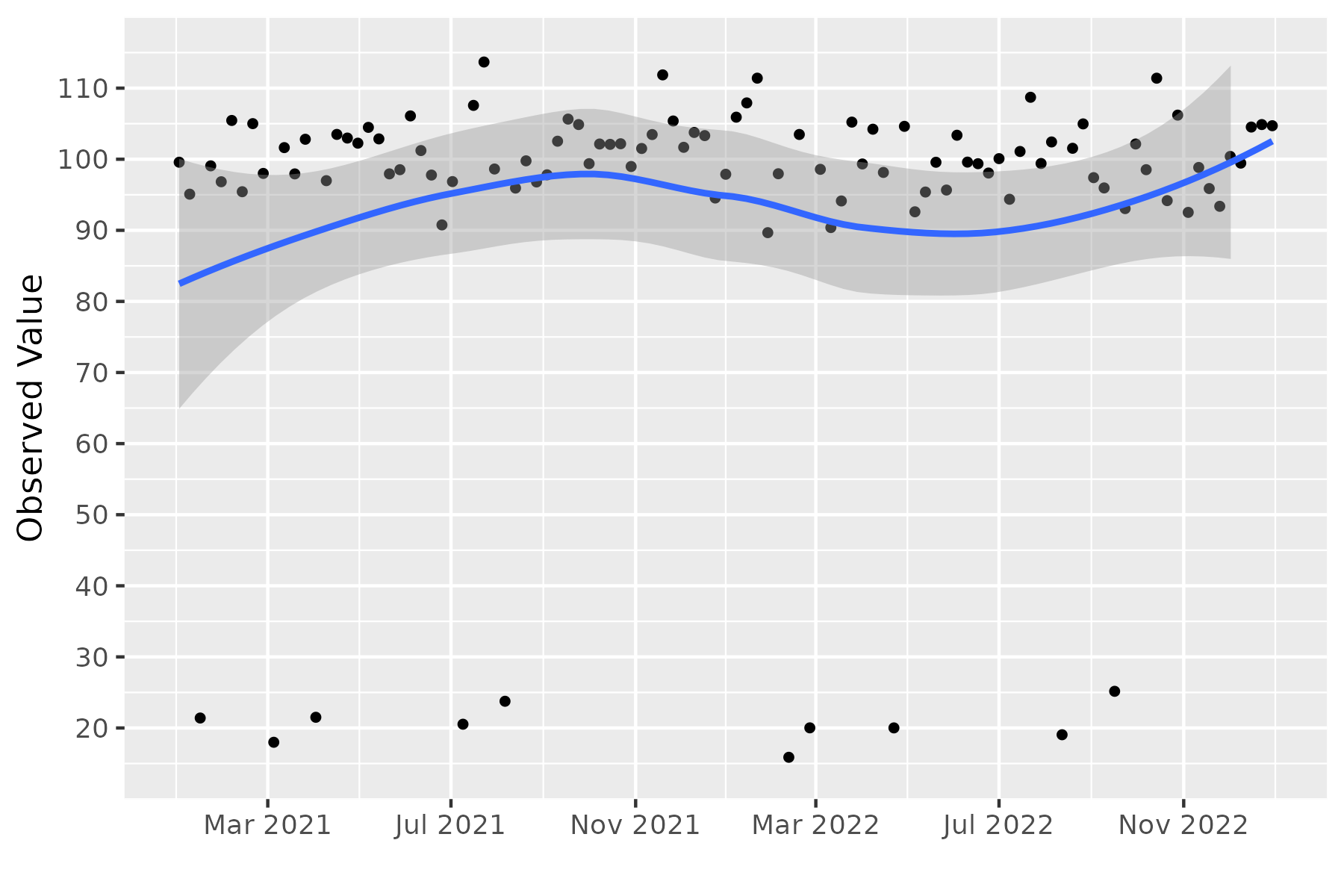
Adding the standard smoothing function
We can see that it has overfit to the measurement error, resulting in a weird output which could be easily misinterpreted.
The easiest way to deal with this would be to filter out all observations below a certain threshold, which would work fine in this case but is not particularly data driven (and also requires time and individual effort to fine tune the graphical output). Instead we can look at using robust methods, many of which are readily available. The MASS package includes the function rlm which allows us to use a robust regression using a reweighted least squares approach. geom_smooth() accepts generic functions so we can plot using this easily using:
p3 <- p + geom_smooth(method = MASS::rlm)
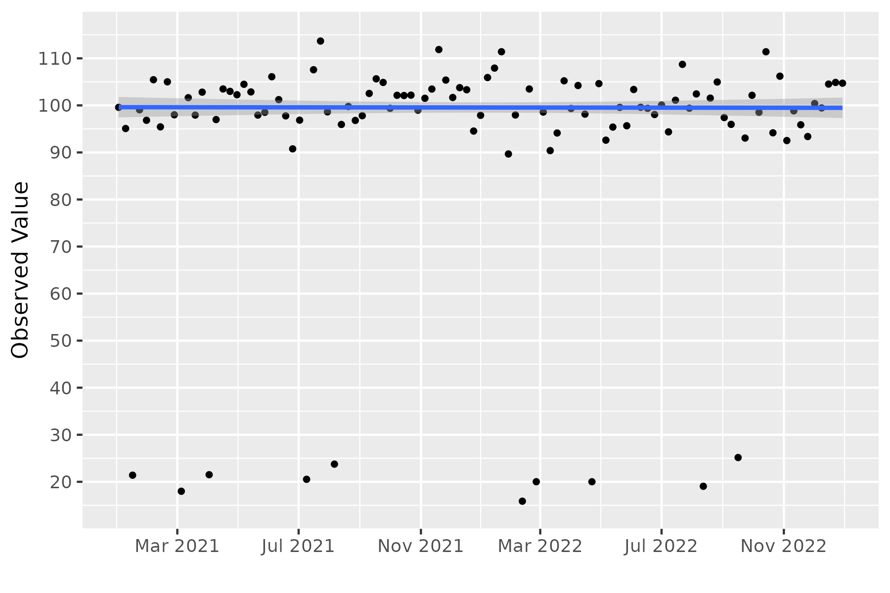
Replacing standard smoothing function with Robust estimator
This correctly results in a plot where geom_smooth() is plotting a straight line at almost exactly 100 (which is the true mean of the sample). In cases where you want this kind of output, robust methods such as this are great tools to have at your disposal.
If you are interested in replicating the graphs all the code can be found in this gist on GitHub. Let me know whether you found this useful in the comments or on Twitter.